My blog has moved!

You will be automatically redirected to the new address. If that does not occur, visit
http://lacqueredlife.com
and update your bookmarks.

Friday, June 29, 2012

Living Outside THE City

So now that we're officially leaving NYC and moving to Charleston, I'm going to have to change a couple of things - specifically in the world of blog inspiration I will have to change my access to some of my favorite interiors magazines. Most of you know that in THE city, magazines come out a day earlier than they do anywhere else, so if you want to be the first to see it, best to buy it and not have a subscription. So when it comes to House Beautiful, Elle Decor, Vanity Fair, Vogue etc. etc. best to just go to your magazine guy and buy it the day it comes out. For my other favorite magazines, which are all from overseas, I had this amazing magazine store in SoHo which always stocked Marie Claire Maison, Elle Decoration UK, and Vogue Living Australia, so I would pop in and buy all of those every month. I can't get these magazines in Charleston, so it looks like subscriptions for me! However, one thing I can get in Charleston, which I have been consistently surprised with of late, is Country Living. 


 These minimalist interiors almost have the feel of many of the interiors I love in the foreign publications! And this is in a former blacksmith shop in the countryside outside of NYC.


Although I will be sad to leave my little magazine bodegas with Marie Claire Maison at my fingertips, and resign myself to waiting for the mailman, Charleston definitely has some good magazines to offer ... and plus, its Charleston. 

Images courtesy of Country Living

Thursday, June 28, 2012

Moving


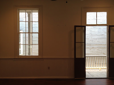
Moving never gets any easier. Growing up, we moved a fair amount, I attended two different colleges as well as studying abroad, and I have lived in three cities since finishing BC five years ago. I should be an old pro - but it really never gets easier. Its not the packing, or the wrapping, or the tossing out - its the emotional part that gets to me. Even though these apartments or houses we occupy are just spaces, they become part of our lives ... they become home. And that is something that you  just can't shake very easily. You feel like you are leaving a member of the family behind when you walk out of your house or apartment for the last time, turn off the lights and lock the door. You never fail to feel like you're forgetting something, even though the space is completely empty. To the outside viewer the space is completely empty, but to you it is filled with the memories of your time there. 

But you know what they say -  when one door closes, another door opens ... 

Photos taken by the author and Taylor Lorenz

Wednesday, June 27, 2012

Oh What a Beautiful Morning


It is an absolutely stunning morning here in Charleston, and I'm thinking about sneaking off to the beach. Just wanted to post some pictures of outdoor things that make me happy, and make me think of summer, as well as Benjamin Moore's Caribbean Blue Water - great color. 


Images courtesy of Marie Claire Maison, Gil Schaefer and Benjamin Moore

Tuesday, June 26, 2012

Maximizing Minimalism

There are certain topics that I cannot stop talking about - especially when it comes to the intersection of historic preservation and interior design. Today's particular topic, minimalist interiors in historic buildings. This particular project: a Chelsea townhouse belonging to a man who produces TV commercials (just like my dad!). Even though I would not call my design aesthetic minimalist, or even modern, there has always been something about a minimalist interior in an ornate historic building that gets to me. The minimalism of the decorating and the interior design always allows the beauty of the building to shine through. 

When you're not distracted, the architectural details jump out at you - like the moulding and the archways ... that's his refrigerator BTW. 

You all know I also love when modern pieces are added to the rear of townhouses, as I posted about here and here. Again, the minimalist nature of the add ons does not distract from the beauty of the historic building. The deck and staircase, as well as the sliding glass door all just seem to fade away. Not only do they seem to fade away, they give a sense that they are easily removed, where if one day another owner wanted to restore the original back of the house, it wouldn't be hard to take the staircase out without any damage to the property. 

What used to be windows, are now doors, that open onto the deck. Again - moulding, door casings, and the transom lights are all the stars of the show. 

The minimalism really allows the owner to stay in touch with the historic nature of the house. Open his medicine cabinet and voila! There is the exposed brick of the party wall between his house and the neighbor. 

Honestly, minimal decorating may not be my style, but in a room like this are you looking at the couch, or are you looking at the bones of this Chelsea beauty? 

Monday, June 25, 2012

The Odd Couple

My husband and I are going to be sharing office space. Yes, that's right, upon the full time move to Charleston, WWB and I will have a co-office. He has big projects on the horizon and I am getting ready to relaunch Lacquered Life (yay!) so I will need some desk space so that I can spend more time with all of you. So ... how does one share office space with someone who is doing something completely different and thus requires a completely different decor? Well we weren't so sure either, but we're working on it. 

It will have to be equal parts this ... 

And this ... 

With a dash of this ... 

And a hit of this ... 

To lead us somewhere like this ... 

Or this. 

We're starting with this. Pretty cool to have an office off a porch, right? Stay tuned for more office updates on Lacquered Life's facebook page!

Images courtesy of Domino, Lonny, Eric Cohler.

Friday, June 22, 2012

Meg Braff in my House

I was thrilled to discover that designer Meg Braff has opened up a shop in Locust Valley, NY. As it is where my mother grew up, I spend quite a bit of time there - and plan on stopping by the new store ASAP. However, while in Charleston, I can spend time in the two places in my house where I chose wallpaper by Meg Braff - the entrance hall, and the powder room. 

Ferns

Grille of Kells

Oops! A sneak peak past the wallpaper, through the dining room, into the kitchen, and out to the garden ... for more Meg Braff wallpaper, check out her website here

Thursday, June 21, 2012

Clouds (and cocktails) in the Sky

I am not particularly art inclined, nor am I aware of all the things going on in the art world in New York, but I do enjoy exhibitions and events when I am made aware of them. I rely on my best friend B to let me know about things that I should check out (she works at MOMA). So upon B's recommendation, last week I went up to the rooftop terrace at the MET to see the Tomas Saraceno "Cloud City" exhibit. Even if you're like me and you're not particularly "artsy," you should definitely go check it out. The rooftop provides a great view of the NYC skyline and the park - plus they're serving cocktails. Sold. A big thank you to B for her recommendation! 


Tuesday, June 19, 2012

A Dress, or a Duvet?

So for a while when I was planning my wedding I was flying a bit under the radar, and I was quite unaware of many of the things going on in the design world, so I apologize if all of you are completely aware of these amazing prints below ... 

Diane von Furstenberg is currently using prints from the DVF archive in duvet covers available through  Bloomingdales, and I am quite taken with them. I went on bloomingdales.com and it seems that that what is left is all on sale! I recommend you take a look. Below are some of my favorites, because honestly you cannot go wrong with some good DVF. 


If I had a bed that needed a duvet, I would head to Bloomingdales right now! All these beauties are on sale. What a way to kick a bedroom up a notch. 

Images courtesy of Bloomingdales.com 

Friday, June 15, 2012

A Little Pink Can Go a Long Way

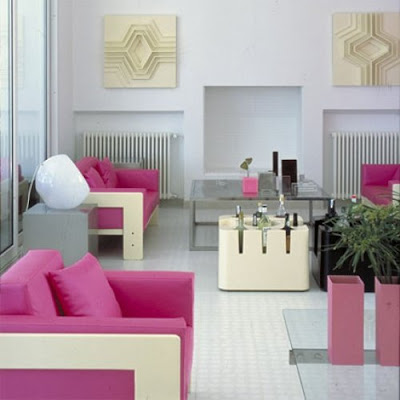
It's funny how quickly a shot of pink can really spice up a room, don't you think? White rooms with a hit of pink are suddenly something special. I think I need a little more pink in my life.  

Photos courtesy of Coastal Living & Marie Claire Maison

Wednesday, June 13, 2012

To Elsie, With Love

When I started this blog three years ago, I started it with a post on Elsie de Wolfe's The House in Good Taste. Today, some of my favorite quotes from that famous text. If you don't have a copy, I suggest you go purchase one. 

"Our ancestors built for stability and use, and so their simple houses were excellent examples of architecture. Their spacious, uncluttered interiors were usually beautiful. House and furniture fulfilled their uses, and if an object fulfills its mission, the chances are that it is beautiful."

"The strongest, the most intense, feeling I have about decoration is my love of color."

"We must learn to recognize suitability, simplicity, and proportion, and apply our knowledge to our needs." 

"The house was very simple, you see, and very small, so when the time came to leave it we had grown to love every inch of it. You can love a small house so completely!"

Photos courtesy of Darryl Carter, Architectural Digest, House Beautiful, Elle Decor
Related Posts Plugin for WordPress, Blogger...